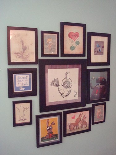
You may remember the collage of art we had up in the rec room. You may also recall that we purchased a couple of new pieces to add to it. Well, that (amazing awesome but huge) bird and worm print threw the whole thing out of whack. It was just so much bigger than everything else, so I reorganized--creating a square "frame" from the other pictures.
I'm not totally sold on it yet. I like this layout best of the ones I tried but I still feel that it is far too regular. I really loved the organic nature of the prior layout...If we keep this, I think we will space them out a bit more and try to find a small square print for the far left corner to complete the square. (Ooh, math reference!)

No comments:
Post a Comment