The main considerations for me were style and stability. I wanted someone who would give me a design I loved AND be able to give me follow up services as I needed them--buttons, small ads, etc.
So I began searching etsy, comparing designers styles, services, and rates. And I was excited to find that one of my favorite designers also offered custom design services. I had long admired Michelle's sketchy organic style and she was a natural fit for the loose, classy vision that I had. I wanted something swirling and organic. Something with a curvaceous, stylish font. Something easily sophisticated. That's pretty much the guidance I gave her and I am delighted with the results.
My new logo:

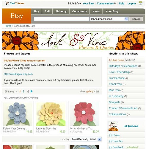
And the new look in my shop:

In honor of having my new brand officially complete (well except for business cards, but those will get here soon!) I will be having a Grand Opening Sale starting tomorrow and running through May 5th! You, as my lovely blog readers, are the first to know. The sale will be for 20% off all purchases (simply buy and wait for a revised invoice before paying, shipping is not discounted). If you also add the code "BLOGGITY" in the note to seller, I will throw in a set of teeny tiny cards as an extra thank you. : )

Looks great!
ReplyDeletei love it. i love the sketchy look. and the light colors with the hard black. awesome.
ReplyDeletegreat banner, and congrats on the new shop!
ReplyDeletebeautiful new banner! looks great :)
ReplyDeleteLooks great, chica!
ReplyDeleteIt's absolutely fantastic!! I love the new look--and a big congrats on the new shop!! Good luck and good sales!
ReplyDeleteSmiles, Karen