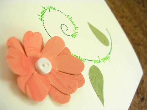
In other (very exciting) news, tonight I sat down and reworked my blog. I have been getting increasingly "blahed-out" on my generic template and distinct lack of sidebar space. So the other day, when someone in the forums mentioned a super blogger who was giving away a three column template I bookmarked it! And today I finally got a chance to implement!
Meet my lovely new layout. Other new and spiffy things include
*My shop banner replaces the heading entirely
*New sidebars--an introduction, an Etsy Mini, and a list of tags
*Older sidebars have been rearranged, renamed, and generally poked at
*A new user pic (though this one gets pretty blurry at that size, I may switch that out later)
*New background and "clicked links" colors
I luff it! Input and suggestions are (as always) appreciated.

Photos are tricky - I'm always learning something new and trying to tweak. LOVE the new layout and colors - great choices!
ReplyDeletePhotography seems to be one big learning experience. Every time I think "WOW these are great!" a few weeks later I'm thinking "UGH those are awful!" Lol. It pushes me to keep improving though. : )
ReplyDeleteAnd thank you! ^_^
It looks great!! I love the green, and your banner, and the 3 columns! Yeah!
ReplyDeleteThe pic of your flower is great--love the angle and the focus.
Smiles, Karen
Thanks Karen! ^_^
ReplyDeleteI love your eye for color, so if you say it looks good, then I know I've done well! : )